

Why Color Palettes Matter in Business
Imagine visiting two websites that offer the same product at the same price. One feels polished, trustworthy, and easy to use. The other feels chaotic and amateur. In many cases, the difference comes down to color palettes.
In branding and marketing, color is not decoration. It is communication. Research consistently shows that color influences first impressions, brand recognition, and even purchasing decisions. For businesses, choosing the right color palette is a strategic decision that directly affects trust, conversions, and long-term brand equity.
This guide explains how color palettes for branding work, how color psychology affects customer behavior, and how businesses can build effective, scalable brand color schemes that support growth.
Color Psychology in Marketing: How Customers React to Color
Color psychology in marketing studies how colors influence perception and behavior. While reactions vary by culture and experience, patterns appear consistently in branding and advertising.
Common Color Associations in Branding
| Color | Common Brand Associations | Typical Business Use |
|---|---|---|
| Blue | Trust, stability, security | Finance, SaaS, healthcare |
| Red | Urgency, excitement, action | Sales, food, entertainment |
| Green | Growth, balance, wellness | Sustainability, finance, health |
| Yellow | Optimism, creativity, warmth | Youth brands, innovation |
| Black | Luxury, authority, elegance | Fashion, premium products |
| Orange | Energy, friendliness | Startups, creative services |
| Purple | Imagination, exclusivity | Beauty, creative industries |
These associations explain why many financial institutions rely on blue, while wellness brands lean toward green. When applied consistently, color becomes a visual shortcut for what your brand stands for.
For businesses developing a long-term identity, understanding these emotional signals is essential. A deeper look at how visual consistency supports brand trust can be found on 365 Business Tips, particularly in their branding and marketing resources.
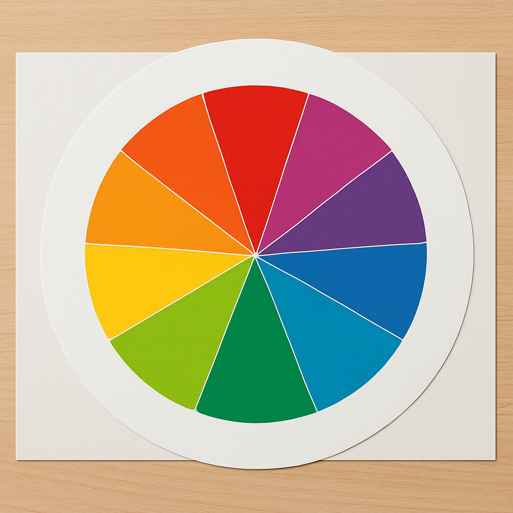
The Color Wheel and Brand Color Schemes
The color wheel helps businesses create palettes that feel intentional rather than accidental. It organizes colors into relationships that designers use to create balance and contrast.
Core Color Groups
- Primary colors: Red, blue, yellow
- Secondary colors: Green, orange, purple
- Tertiary colors: Combinations like blue-green or red-orange
From these groups, designers build structured brand color schemes.
Popular Color Schemes for Branding
- Monochromatic: Variations of one color; clean and professional
- Analogous: Neighboring colors; calm and harmonious
- Complementary: Opposite colors; high contrast and attention-grabbing
- Triadic: Three evenly spaced colors; vibrant but balanced
For business websites and marketing materials, complementary and analogous schemes are especially effective when combined with neutral backgrounds.
Assigning Roles to Your Brand Colors
Strong color palettes follow a hierarchy. Each color has a job.
- Primary color: Core brand identifier used most frequently
- Secondary colors: Supporting tones for sections, graphics, or highlights
- Accent color: Used sparingly for calls to action and key interactions
- Neutral colors: Whites, grays, and blacks that improve readability
Many designers follow the 60–30–10 rule:
- 60% neutral or background color
- 30% secondary color
- 10% accent color
This structure keeps branding consistent across websites, ads, presentations, and social media.
Current Trends in Color Palettes for Branding
1. Earthy, Neo-Organic Palettes
Businesses are increasingly adopting warm, natural colors such as terracotta, olive green, sand, and soft browns. These palettes feel authentic and human, especially appealing to sustainability-focused and lifestyle brands.
Why businesses use them: – They communicate trust and stability – They reduce visual fatigue – They align well with wellness and ethical branding
2. Futuristic and High-Contrast Digital Palettes
Technology and gaming brands are leaning into dark backgrounds paired with neon or iridescent accents. These palettes convey innovation, speed, and confidence.
Best use cases: – SaaS platforms – AI and tech startups – Gaming and entertainment brands
A growing number of companies now adapt their palettes dynamically, offering light and dark modes to match user preferences.
How to Build a Brand Color Palette Step by Step
Step 1: Define Your Brand Personality
Ask what your business should feel like: trustworthy, bold, friendly, premium, or innovative. Your primary color should reinforce this identity.
Step 2: Choose a Color Scheme
Use the color wheel to select complementary or analogous colors that support your primary tone without overpowering it.
Step 3: Test Accessibility and Readability
Colors must meet accessibility standards. Text should have enough contrast to remain readable for users with visual impairments or color blindness.
Step 4: Apply Consistently Across Channels
Consistency builds recognition. A helpful overview of maintaining visual consistency across digital channels is available at 365 Business Tips.
Practical Use Cases for Business
Websites and Landing Pages
- Neutral backgrounds improve readability
- Accent colors highlight calls to action
- Consistent button colors increase conversions
Marketing Materials and Presentations
- Primary colors for headings
- Secondary colors for charts and diagrams
- Accent colors for key data points
Product and App Design
- Limited palettes reduce cognitive load
- Clear contrast improves usability
Tools for Exploring Color Palettes
Businesses do not need to start from scratch. Several tools help generate and explore palettes efficiently.
- Colorik offers curated color palette inspiration suitable for branding and digital design:
- Colouring Cave provides interactive and creative ways to experiment with color combinations.
Color palettes are a strategic asset in branding. When grounded in color psychology, structured through proven design principles, and applied consistently, they help businesses build trust, improve usability, and increase conversions.
Rather than chasing trends blindly, successful brands treat color as part of a long-term system—flexible enough to evolve, yet consistent enough to remain recognizable.
Real-World Examples of Color Palettes in Business Branding
Successful brands use color palettes consistently across every customer touchpoint. Financial and technology companies often rely on blue-dominant palettes to communicate trust, stability, and security. This visual consistency helps reduce friction for users, especially when they are asked to share personal information or make financial decisions.
E-commerce and consumer brands frequently use higher-contrast palettes to guide attention and influence behavior. Bright accent colors such as red or orange are commonly reserved for call-to-action buttons, helping users quickly understand where to click. When used sparingly, these accents create urgency without overwhelming the overall design.
Wellness and lifestyle brands typically favor earth-toned palettes that feel calm, natural, and authentic. When these colors are applied consistently across websites, packaging, and social media, they help build emotional connections and long-term brand loyalty. Across all industries, the most effective color palettes are those that clearly support brand values and business goals.
Color Accessibility and Brand Responsibility
Accessible color palettes are an essential part of modern branding. Colors must provide enough contrast so text and interactive elements remain easy to read for all users, including those with visual impairments. Designs that ignore accessibility can frustrate visitors and reduce trust in a brand.
Businesses should avoid relying on color alone to communicate important information. Icons, labels, and visual cues should work alongside color to ensure clarity for users with color vision deficiencies. Accessible design strengthens brand credibility, expands audience reach, and demonstrates a commitment to inclusivity.
Color palettes are a strategic asset in branding. When grounded in color psychology, structured through proven design principles, and applied consistently, they help businesses build trust, improve usability, and increase conversions.
Rather than chasing trends blindly, successful brands treat color as part of a long-term system. A well-designed palette should be flexible enough to evolve while remaining consistent enough to be instantly recognizable across platforms and campaigns.
Frequently Asked Questions
How many colors should a brand palette include?
Most effective brand palettes include three to five colors: one primary, one or two secondary colors, one accent color, and neutrals.
Should businesses follow color trends?
Trends can inspire campaigns, but core brand colors should remain stable for recognition.
What is the difference between RGB and CMYK?
RGB is used for digital screens, while CMYK is used for print materials. Always design in the correct color mode for the final output.